
Saving Head Start

Falling rates, rising risk: Vaccination rates down in California

Five Years Later: Covid’s Lasting Impact on Education

Getting Students Back to School

Calling the cops: Policing in California schools

Black teachers: How to recruit them and make them stay

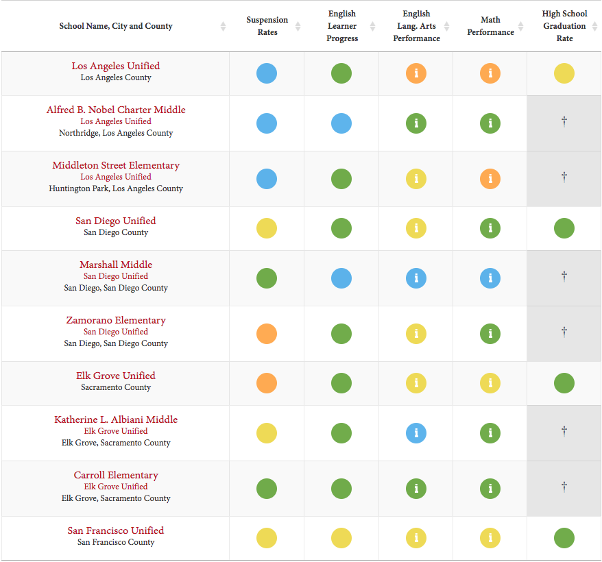
The California School Dashboard is back in full color for the first time in four years.
The dashboard, which the California Department of Education will release on Friday, is the state’s academic accountability and improvement tool designed for parents and educators. It rates the performance of every school, district and charter school, along with any of 13 student groups that attend them, with a color on seven indicators of performance, including math and English language arts test scores, chronic absence rates and graduation rates.
First introduced in 2016-17, the dashboard was suspended because of the pandemic in 2019-20 and 2020-21, and resumed this year with the collection of two consecutive years of data needed to generate color ratings.
Here’s a guide to the dashboard for first-time viewers and for those who need a brush-up course on how to read and interpret the colors and the data behind them.
Why the dashboard?
The Local Control Funding Formula, passed by the Legislature in 2013, required it — or something close to it.
Dissatisfied with the Academic Performance Index, which assigned a three-digit ranking to districts based exclusively on test scores, legislators mandated a broader look at school performance and conditions of learning through multiple measures. There would be no summative ranking; instead, there would be components, such as suspension rates, that would provide evidence for specific actions for improvement. The Legislature required that districts and schools highlight lowest-performing student groups, not just districtwide averages for all students that can shroud inequalities. The intent was to tie actions in a district’s three-year improvement strategy, the Local Control and Accountability Plan, or LCAP, to results in the dashboard.
The dashboard also marks a shift away from the mindset of the federal No Child Left Behind Act. Instead of punishment for low performance, the funding formula promises guidance and assistance to districts with low-performing student groups. As State Board of Education President Michael Kirst and then-state Superintendent of Public Instruction Tom Torlakson wrote in a 2017 commentary for EdSource, “We have a rare opportunity to turn data into direct action. The state is now able to identify specific challenges school districts are facing and is committed to providing assistance rather than the sanctions of the past.”
Which are the 13 student groups?
African American, American Indian, Asian, English learners, Filipino, foster youth, Hispanic, homeless, two or more races, Pacific Islander, socioeconomically disadvantaged, students with disabilities, and white.
What are the performance indicators?
Chronic absenteeism measures students from kindergarten through eighth grade who were absent at least 10% of school days during the academic year, or at least 18 days.
English learner progress indicator, which is new this year, measures progress toward English language proficiency by measuring English language learners’ results on the English Language Proficiency Assessments for California from the current to the previous year.
Suspension rate measures the percentage of students who were suspended for a total of one full day anytime during the school year (multiple suspensions of the same student are not factored in).
Graduation rate measures the percentage of students receiving a high school diploma within four or five years or who complete graduation requirements at an alternative school.
College/career indicator measures the percentage of high school graduates who are prepared for college or a career. It looks at the number of students who completed or fulfilled one or some of the following metrics:
Schools or districts where 55% of students meet the criteria are rated high performance; at 70%, they are rated very high.
English language arts indicator measures the Smarter Balanced test results and the California Alternative Assessments for grades three to eight and grade 11. It is determined by students’ average distance in points below or above the score that indicates a student performs at standard for the grade. A school’s or district’s participation rate counts, too.
Math indicator measures the Smarter Balanced test results and the California Alternative Assessments for grades three to eight and grade 11. It is determined by students’ average distance in points below or above the score that indicates a student performs at standard for the grade. A school’s or district’s participation rate counts, too.
Why are there colors?
Seeking to create a tool that encourages improvement, the state board concluded that the most constructive measure would include both the results for the current year and an indication of whether those scores increased or decreased from the year before. A color reflects the intersection between both variables: the current status and one-year change; both factors are given equal weight. Schools with previously very low math scores that show significant improvement the next year, for example, are rewarded by moving up from red to yellow or green. Schools that suspended lots of kids this year compared with the year before will see the color change from green to yellow or orange — a signal that it’s time to pay attention and ask why.
How are colors determined?
 Source: California School Dashboard
A look at a five-by-five grid provides the answer. For every indicator, the results for the current year are divided into five performance categories, listed from top to bottom: very high, high, medium, low and very low. Change in performance from the previous year is also divided into five categories, listed from left to right: declined significantly, declined, maintained, increased, increased significantly. As in bingo, mark your X on the intersection of vertical numbers on the left with the horizontal numbers at the top.
To illustrate, consider the graduation rate of Santa Ana Unified. Its 89.7% graduation rate in 2023 is 3.3 percentage points higher than the state average, but the decline of 2.8 percentage points from 2022 pushed it from what might have been green or yellow to orange.
You have to look at the underlying data to understand a color, especially yellow. It could indicate good news or bad, depending on the change from the year before. It doesn’t mean satisfactory.
Have the cut scores defining the performance levels and change been reset to reflect learning setbacks resulting from Covid?
No. The same criteria that determined a red or blue in 2017 applies to 2023. However, because of the suspension of the dashboard during the pandemic, the 2023 dashboard will reset the rating process. Test scores were higher and chronic absences were a lot lower pre-pandemic than in 2023. Color ratings in 2023 understate some of those disparities by comparing 2023 results with those of 2022, the first post-pandemic year. An EdSource analysis, found in 2019, 82 districts scored very high in math and 47 districts scored very low. In 2023, 63 districts scored very high, and 137 scored very low.
Why is there no color this year for the college and career indicator?
The results of the Smarter Balanced tests in 11th grade in math and English are a metric used to determine that indicator. There need to be two years of test results to measure change on the dashboard. No test was given in spring 2021, so there was no score for the class of 2022 and therefore no way to compare it with the 11th grade results for the class of 2023. Next year, there will be a color for the 2024 dashboard, with the publication of 11th grade scores in 2023 for the class of 2024.
What is the equity report?
The equity report is what you turn to by clicking on any performance indicator on the home page for any district or school. It takes you to a color breakdown of all 13 student groups with enough students to be measured. Click further, and it will show the underlying data — scores and the change from the year before — for each student group. Comparing the groups reveals disparities and rates of improvement, evidence for setting goals in the Local Control Accountability Plan to close achievement gaps.
How does the dashboard define what low-performing districts and charter schools qualify for extra help, called differentiated assistance?
It’s complicated.
In writing the funding formula, the Legislature said that districts, county offices of education and charter schools should be held accountable for performance in several priority areas. The state’s seven statewide performance indicators fall within them: school climate (suspension rates); pupil engagement (graduation rate and chronic absences) and pupil achievement (the English Learner Progress Indicator and the math and English language arts tests).
Districts and charter schools are eligible for differentiated assistance when one or more student groups get a red rating in two or more priority areas. They will receive help from a county office of education; poor-performing county offices, which also run schools, will get help from the state.
In 2023, 466 school districts and county offices of education will be eligible for differentiated assistance; they represent 47% of the total. That’s 151 fewer than in 2022; the biggest factor was a decline in the rate of chronic absenteeism. While still at historic levels, the 5.7 percentage point statewide drop from 30% pushed the state and most districts into yellow, from what would have been red.
The Legislature also established priority areas for which there are no statewide measures: Basic school conditions, such as appropriately assigned credentialed teachers and clean and functional school facilities; implementation of state academic standards; parent and family engagement, and access to a broad course of study. Districts have local options on how to verify annually that the standards have been met. A failure to meet the standards in a local priority area for two consecutive years can also qualify a district for differentiated assistance.
This year, for the first time, districts must address in their Local Control Accountability Plans how they will address student groups performing in the red on any indicator in any school. This new mandate is intended to ensure funding from the Local Control Funding Formula is directed to the students with the most needs.

In California, only 30% of Black children can read proficiently by the end of third grade. To change this narrative, we must act decisively and early.

On July 1, the unpopular Reading Instruction Competence Assessment will be replaced with a performance assessment to ensure teachers are prepared to teach students to read.

The National Council on Teacher Quality gave most graduate credentialing programs an “F” in elementary math preparation. Are math and everything else too much to squeeze into a year-long program?

A quick screening test will be administered to all students in kindergarten through second grade to detect possible reading difficulties, but it is not intended to be a final diagnosis.


Comments (6)
Comments Policy
We welcome your comments. All comments are moderated for civility, relevance and other considerations. Click here for EdSource's Comments Policy.
Kendra Fehrer 10 months ago10 months ago
This is such a fabulous resource John. Thank you. I’m sharing the link and referencing some of the content in materials for families and new community school coordinators in the districts I work with.
Virginia D'Amico 1 year ago1 year ago
I have an interest in finding out how many students with military status are enrolled in California districts. I’ve looked at Dataquest and https://caaspp-elpac.ets.org/. There is a law meant to help these students that in many ways echoes those laws meant to help students in foster care succeed. Have you done any reporting on the success of military status students?
Kim Kenne 2 years ago2 years ago
John – this explainer is very clear and easy to understand. Great job. I leave the discussion on whether the dashboard sets high expectations or helps people really understand student performance to another conversation….
Replies
John Fensterwald 2 years ago2 years ago
Thanks, Kim. I welcome your thoughts on the usefulness of the dashboard.
Dr. Bill Conrad 2 years ago2 years ago
Rebuild it and they will not come! Field of nightmares! I spent a career creating heat mapped data visualizations and data inquiry protocols for schools and school districts believing that education leaders would use the data as a catalyst for improving curricula, practices, and assessments. How wrong that theory of action was! Leaders were more than satisfied in seeing a 2 percentage point gain in Latino student math performance from 21% proficient to 23% proficient! And of course … Read More
Rebuild it and they will not come!
Field of nightmares!
I spent a career creating heat mapped data visualizations and data inquiry protocols for schools and school districts believing that education leaders would use the data as a catalyst for improving curricula, practices, and assessments.
How wrong that theory of action was! Leaders were more than satisfied in seeing a 2 percentage point gain in Latino student math performance from 21% proficient to 23% proficient!
And of course poor student academic performance can be blamed on a plethora of reasons! Always avoiding the role professionals play in advancing student academic achievement!
Superintendents love an accountability dashboard that includes everything but the kitchen sink. That way they can avoid the pesky problem of improving student academic achievement and can focus on graduation rates! Staff can easily manipulate the rules for calculating graduation rates! And voila! Superintendents meet their contract goals and win large salary increases. Works every time!
Too bad it doesn’t work too well for children and families! Who looks out for them? Certainly not most school systems! Especially for our children of color!
Brenda - Teacher 2 years ago2 years ago
So according to this new Dashboard, Schools where 55% of students meet the criteria are rated HIGH performance; at 70% they are rated VERY HIGH. I have been a teacher for nearly 30 years and have taught every basic subject. In the typical grading scale, 50-59% is considered an F and 70% is considered a C-. So an F score is now considered a B for school district evaluation and a … Read More
So according to this new Dashboard, Schools where 55% of students meet the criteria are rated HIGH performance; at 70% they are rated VERY HIGH. I have been a teacher for nearly 30 years and have taught every basic subject. In the typical grading scale, 50-59% is considered an F and 70% is considered a C-. So an F score is now considered a B for school district evaluation and a C- is now considered an A? WOW! There is something really wrong with this picture.