
Black teachers: How to recruit them and make them stay

Lessons in higher education: What California can learn

Keeping California public university options open

Superintendents: Well-paid and walking away

The debt to degree connection

College in prison: How earning a degree can lead to a new life
The much-maligned California School Dashboard is getting a makeover.
The dashboard is the website that rates districts, schools and student groups on test scores, student suspensions and a range of measures on a scale of five colors. It’s a key element of the state’s new school accountability system, which emphasizes performance on individual indicators without a single summative rating like a letter grade.
Since its debut in spring 2017, the dashboard has gotten a lot of criticism. Parent and school groups said they appreciated the extensive data but not the presentation, which they called confusing and hard to use. Gov. Jerry Brown responded with $300,000 in the state budget for the state to rebuild the site and hire a firm well-known for design work, Collaborative Communications, a Washington, D.C., firm that has designed data websites for organizations like the Data Quality Campaign and governments, including New York City schools.
Dashboard 2.0 won’t roll out until the next data update scheduled for December, but prototypes are drawing good reviews. The state Board of Education will take a look at its meeting on Thursday.
The dashboard’s target audience will be informed parents involved in their school, and parents on an advisory committee setting priorities for the district’s annual accountability report, called the Local Control and Accountability Plan or LCAP.
“It shouldn’t be the burden of families and students to figure out data,” said Norma Rodriguez, organizing and policy director for the nonprofit Californians for Justice. A group of parents and students got an early peek at the new work and agreed that it will be easier to see how children are doing in their schools, she said.
Rodriguez said Californians for Justice “appreciated that the department reached out to high-needs students and parents for their input” on how to make the dashboard useful for them.
Every PTA member she spoke with thinks the new dashboard will be an improvement, said Mary Perry, vice president for education at the California State PTA, who showed a prototype to parent leaders.
The most obvious change: No more icons of full and partially eaten pies with the number of slices corresponding to one of five performance levels (3 slices for yellow, the middle performance level, 1 for red, the lowest score). Instead, there will be a simple gauge with an arrow pointing to a color. This accommodates visual disabilities and printers that don’t print colors (see examples).
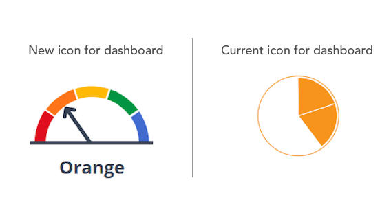
“The movement from pies to using gauges is a real plus — far more intuitive,” said Perry.
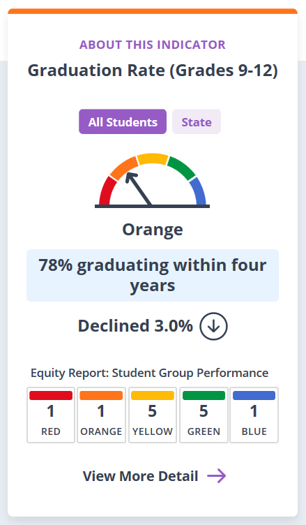
Under the new prototype, each performance indicator would get its own “card,” which would show how students overall did — in this case, with graduation rates. The school or district would be designated orange, the second lowest color, because the rate had dropped from the previous year to below the state’s graduation target. The “equity report” shows how many student groups performed in each color.
Other big changes:
Clearer and easier to navigate: There will be 80 percent fewer web pages by eliminating redundancy and referring “superusers” who want more details to other pages on the Department of Education web site, said Cindy Kazanis, the director of the Analysis, Measurement and Accountability division of the state Department of Education. Users will move up and down to see more data instead of clicking through to another page.
Friendlier landing page: The new landing page is simpler. Each performance measure, like math scores on the Smarter Balanced tests, is a baseball card that a user will be able to flip over for more details on student groups’ ratings. And they’ll be able to compare overall school or district test scores with state averages — a new feature.
Designed for mobile devices: For many families, cell phones are their computers. Mobile platforms were an after-thought for the current dashboard, which was rushed into service to meet a posting deadline.
Real Spanish translations: Web translating tools tended to come up with inaccurate translations of academic terms. The new dashboard will use experienced Spanish translators.
Simpler language: Needless terms like “status” and “change,” referring to the data elements behind the selection of a color, were dropped. Percentages and up/down arrows tell the story.
There’s still work to be done. The site must be rebuilt, and the state board may want additional changes. Kazanis said that the department continues to struggle with explaining some of the data behind the ratings — how, for example, student scores on the Smarter Balanced point scale translate into colors on the dashboard.
Collaborative Communications based its work on findings from a half-dozen meetings with parents who shared what they liked and disliked about the current dashboard, organized by the CDE Foundation. “What I saw in prototype addressed the concerns” that the parents raised, said Paul Richmond, consultant to the foundation who organized the sessions.

The overreliance on undersupported part-time faculty in the nation’s community colleges dates back to the 1970s during the era of neoliberal reform — the defunding of public education and the beginning of the corporatization of higher education in the United States. Decades of research show that the systemic overreliance on part-time faculty correlates closely with declining rates of student success. Furthermore, when faculty are… read more

Panelists discussed dual admission as a solution for easing the longstanding challenges in California’s transfer system.

A grassroots campaign recalled two members of the Orange Unified School District in an election that cost more than half a million dollars.

Legislation that would remove one of the last tests teachers are required to take to earn a credential in California passed the Senate Education Committee.


Comments (4)
Comments Policy
We welcome your comments. All comments are moderated for civility, relevance and other considerations. Click here for EdSource's Comments Policy.
Glenn Cox 6 years ago6 years ago
The only true measure of a student’s achievement level is a standardized test score where each student is given a percentile ranking.
Tom Nelson 6 years ago6 years ago
The performance information being reported has a different focus than in the past. Performance comparisons now focus on a smaller perspective of the school's previous performance. Performance comparisons used to have a wider perspective of how a school performed compared to other (similar) schools in the state. When California education lags behind so many other states, this change in focus enables progress at a snail's pace to be acceptable for many of the lowest performing schools. … Read More
The performance information being reported has a different focus than in the past.
Performance comparisons now focus on a smaller perspective of the school’s previous performance.
Performance comparisons used to have a wider perspective of how a school performed compared to other (similar) schools in the state.
When California education lags behind so many other states, this change in focus enables progress at a snail’s pace to be acceptable for many of the lowest performing schools. The achievement gap between high and low performing schools will likely continue because comparisons between schools are not reported.
That is a disservice to our democratic philosophy of creating equality for all people.
Frances O'Neill Zimmerman 6 years ago6 years ago
This is an improvement over the dodgey ditched dashboard — any change would have been a plus.
Big picture becomes clear: California schools are not in the clear-blue or new-growth-green.
Doug McRae 6 years ago6 years ago
The redesign of the Dashboard appears to be a step forward for displaying and communicating the substantive meaning of the underlying graphics involved. However, it is only a surface change; if the underlying numbers are flawed for many of the multiple measures displayed, the strategic decisions made by local districts and schools based on Dashboard displays will remain flawed. I would particularly point to the "change" metrics for California's new status-and-change multiple measures accountability system as … Read More
The redesign of the Dashboard appears to be a step forward for displaying and communicating the substantive meaning of the underlying graphics involved. However, it is only a surface change; if the underlying numbers are flawed for many of the multiple measures displayed, the strategic decisions made by local districts and schools based on Dashboard displays will remain flawed.
I would particularly point to the “change” metrics for California’s new status-and-change multiple measures accountability system as problematic and flawed. It will take several years for the “change” metrics to mature before the new system can support reliable strategic decision making.